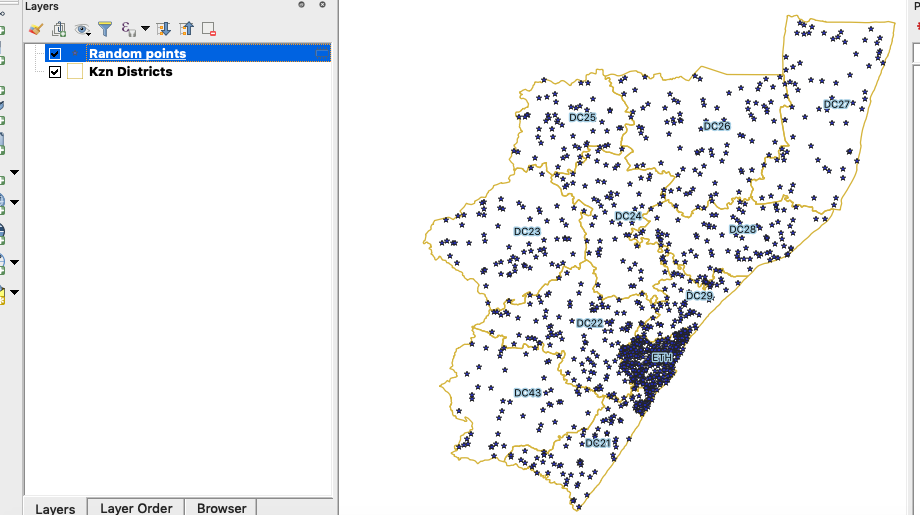
Thematic mapping - Creating dot density maps
“Dot density maps are a thematic representation to show density distributions across geographical landscapes.”
Population distribution describes a way in which people are spread across the earth's surface. Population distribution is usually shown by a dot density map where each dot represents a certain number of people.

You try:
Goal: Create a dot density map where 1 dot represents 10000 people.
- Follow the table join tutorial
- Activate the processing toolbox and choose the refactor fields algorithm.
- Change the data type for (area_km, population_2016 and density) to the specified Column type
- Run the algorithm and reproject the layer Refactored to a knows CRS. The output should be a layer named kzn_districts.
- Remove all layers except the kzn_districts.
- Open the attribute table for the loaded layer.
- Toggle edit the layer and use the field calculator to add a new column called pop_10k. The new column should be of the specified Column type
- Populate the new column using the expression * "population_2016" / 10000*.
- Save the edits.
- In the processing toolbox selects the algorithm Random points inside polygons.
- Make the Point cloud or density value equal to the pop_10k field.
- Style the kzn_districts layer so that it only shows the outline of the layer.
- Also style the generated points layer.
TO DO
Try to create a heatmap from the random points generated and see how it looks like.
| Name | Expectation |
|---|---|
CRS ❗ |
EPSG:3857 or any other that of the specified Projection |
Spatial algorithm ❗ |
Random Points Inside Polygon |
Column type ❗ |
Type - Double,Length - 10 , Precision - 3 |
Projection ❗ |
Albers Equal Area Conic, Sinusoidal, and Cylindrical Equal Area |

More about
Dot maps are advantageous when mapping phenomena that change smoothly over space, as the dot maps will visually match the phenomena. There are two basic types
- One-to-one dot density maps (one dot represents one object or count)
- One-to-many dot density maps in which one dot stands for a number of things or a value (e.g 1 dot = 1,000 people)
NB All dot density maps must be drawn on an equal area map projection. This is critical — using a map projection which does not preserve the size of areas will distort the perceived density of the dots. Albers Equal Area Conic, Sinusoidal, and Cylindrical Equal Area are all good choices.

Check your knowledge:
-
What is it useful to know population distribution:❗
- Because it will interrupt human activity like a farming
- For planning purpose, resources use against people
- It does not matter as long as we know the population density
-
What is population distribution and how is it represented in a GIS:❗
- A type of gis dataset that shows how people behave
- The spread of people across the terrain
- Spread of points in a vector layer
-
Which of the following statement is true:❗
- Raw data or simple counts can be mapped on a dot density map.
- A choropleth map and a density map are the same thing.

Further reading:
-
Qgis-population-density-tutorial: http://smsgis.co.za/qgis-population-density-tutorial/ ❗
Download the sample data for the lesson.
