Styling in Context
“If you think of GIS as having two major aspects, data and visualisation, then the visualisation is all about styling or symbology”
Data does not look pretty without a style. Geometry data has to be styled to be visualised.
In this module, we will find some entry points to styling spatial data in QGIS. Styling is a very broad and deep field, part art, part science. So most of this module is about exploring styles, freestyle.

You try:
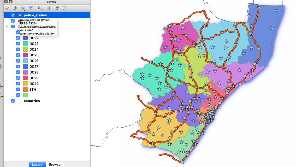
Goal: Explore vector layer styles and make a pretty map.
- Load the layers in the exercise data.
- Change the rendering order so that points are at the top, lines and polygons at the bottom.
- Zoom to the extent of the District layer.
- Open the Countries' Layer Properties and go to the Symbology tab. Choose options as per the table below.
- Look at Districts' attributes and style it in a way you think is meaningful. Note the styling options available for polygons.
- Style Roads. Choose options as per the table below. Note the differences in Line styles.
- Style Police stations. Choose options as per the table below. Note the differences in Point styles.
- Compare your map with your neighbour's
Check your results
Can you clearly see all four layers in your map?
Why is there a gap between the district and country boundaries? What could you do about it?
What message were you trying to convey with your map? Did your neighbour get the message?
Do your neighbour like your colour scheme as much as you did?
| Name | Expectation |
|---|---|
Country styles |
|
Layer type |
Simple fill |
Fill style |
No brush |
Border colour |
black |
Point Style |
|
Simple Marker |
Star |
Size |
6 |
Fill Colour |
#a6cee3 |
Road Style |
|
Simple Marker |
topo main road |

More about styling
When you open a layer in QGIS it will choose a fairly random default style so at least you can see the data. Usually, that default style is no good for your final map so you will have to spend some time styling it to meet your objectives. Perhaps you or someone else already prepared a style and saved it as a default; in that case you are lucky and it will be aesthetically pleasing.
Styles are all about communication. Very often that communication is scientific or statistical and therefore must represent the facts in an unbiased way. Or it could be topographical or navigational in which it should be clear and easy to understand. Or perhaps it purely artistic and just needs to look beautiful. The best maps combine all of these: accuracy, clarity and aesthetics. Effective styling applies the elements of good design.
Static maps are styled to look good at a specific scale. This can take a lot of work to achieve. Dynamic maps, such as interactive online maps (like OSM or Google), are styled to work at any scale. This is even harder to achieve since you need to style for multiple scales and also alter the data available for styling at each scale by filtering or generalising.
In a GIS a map is made up of several layers. It is quite an achievement to style and label one layer effectively and it can take a lot of time. To style and label many layers so that together they make a beautiful map is a real craft.

Check your knowledge:
-
Which of the following combination of layer types can you apply fill colour:
- Lines and points
- Polygons and points
- Points, lines and polygon
-
Is it possible to assign colours on polygons based on an attribute:
- True
- False
-
Our road style consist of two symbols overlaid together. Is it possible to overlay 3 symbols:
- It is not possible
- Yes it is possible but you have to define the order which they should draw.
- It will cause QGIS to crash.

