Colour Ramps for vector data in Context
“Colour ramps provide the means to apply a range of colours to a group of symbols. These symbols can be for raster or vector data.”
In this module, we will explore how vector data can be symbolized using colour ramps. QGIS ships with a number of pre-defined colour ramps, but you can also create your own. Colour ramps let you express numeric changes in a way that is easy for your eyes to interpret.

You try:
Goal: To learn where to find additional colour ramps in QGIS and where they can be used.
- Load the layers from the exercise data.
- Open the attribute tables and spend a couple of seconds understanding the data.
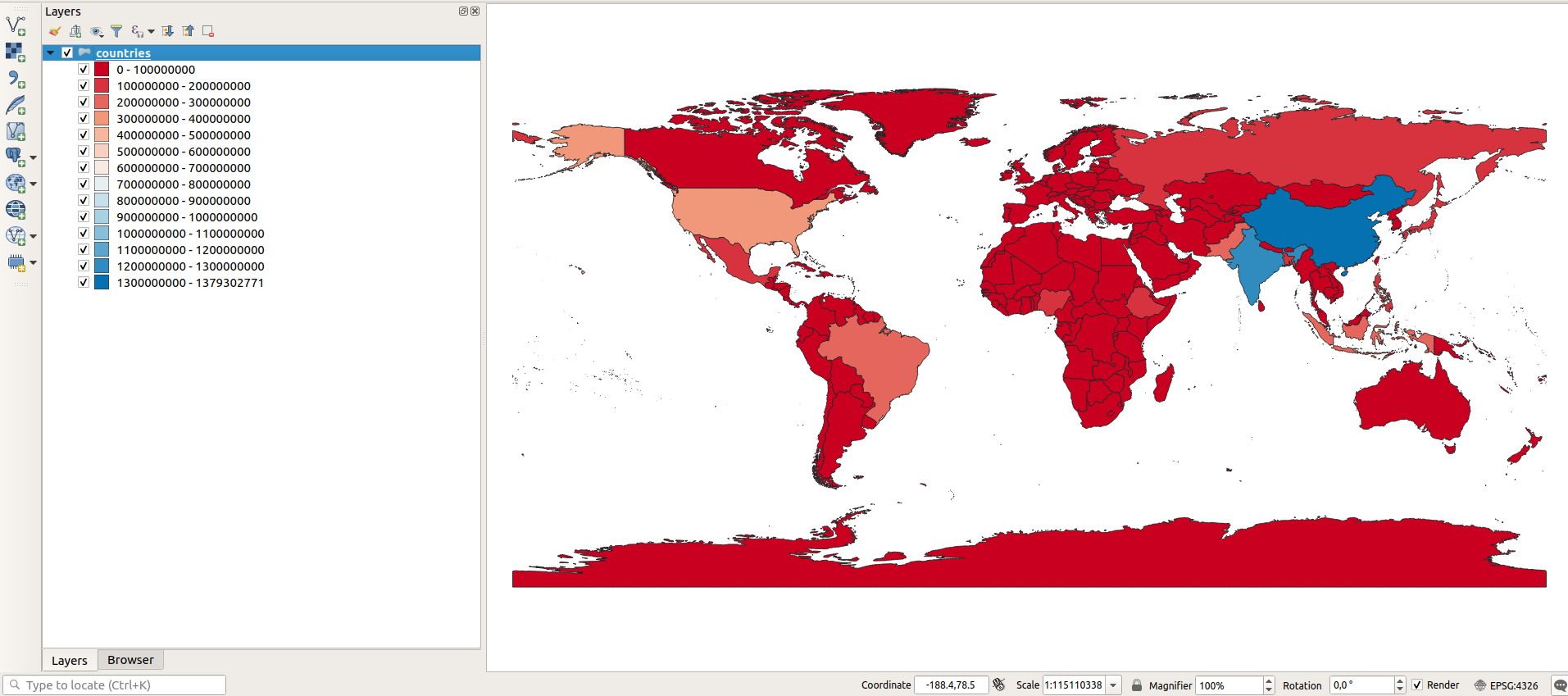
- Symbolize the layer using the options specified below.
- Create a new colour ramp using Pop-ramp
- You used Pretty Breaks during the classification. Play around with the other modes and explore what happens i.e Quantile, Standard Deviation.
Check your results:
Part 1: Once you have assigned the vector colour ramp, your map should look something like the image above (top).
| Name | Expectation |
|---|---|
Render Type |
Graduated |
Classification column |
pop_est |
Pop-ramp |
|
Ramp Type |
RdBu |
Mode |
Pretty Breaks |
No of classes |
10 |

More about colour ramps
QGIS uses the same colour ramp system wherever colour ramps are used including:
| Name | Value |
|---|---|
| Vector | Gradient fill |
| Vector | Shapeburst fill |
| Vector | Categorised fill |
| Vector | Graduated fill |
| Vector | Heatmap |
As well as using one of the many built-in colour ramps, you can also create your own colour ramps using the ramp editor.
Be careful when using colour ramps - colours can make information easy to understand if used wisely, but the human eye cannot easily interpret subtle colour differences so using many classes often won't improve information handover.
If you want a comprehensive collection of colour ramps, install the Colour Ramp Manager plugin and install the full CPT ramp collection.
