Multi page layouts in map composer in Context
“The basic map elements are scale bar, north arrow , legend, map title and layer. All these elements can be shown on a single page or spread across multiple pages.”
A map is a measuring instrument and hence the scale bar should be a true reflection of the distance on the ground. The symbology of the layer should be an indication of what theme was being mapped. So it is imperative not to clutter a map by adding all the elements on the same page.
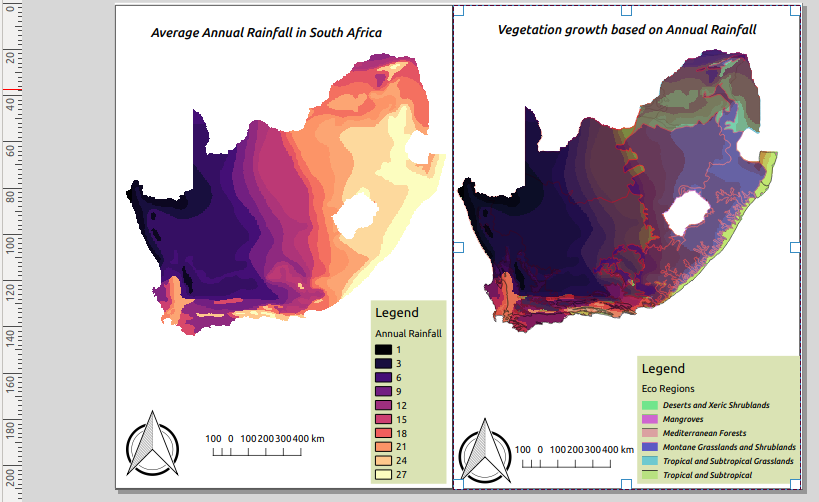
In this module, we look at how to use map themes to represent different scenarios for the same data and how they can be spread across multiple pages to produce an aesthetically beautiful map.

You try:
Goal: To explore how map themes can be used produce maps spanning across multiple pages.
- Load the Layers from the exercise data.
- Symbolize the raster layer using Raster style.
- Symbolize the vector using Vector style.
- Change the rendering order to put raster layers at the bottom of the layer list.
- Create a map theme named Map 1.
- Use the Raster style to symbolize the raster image and use the spectral colour ramp instead of the ramp specified in Raster Style
- Toggle visibility to off for the vector layer.
- Create a map theme named Map 2.
- Add a new map layout and change the page size to your prefered settings ie Portrait or Landscape
- Add a map and in the properties of the map make sure it follows Map 1 theme.
- Add all other elements of the map. ie legend etc and position them accordingly.
- Add a grid using the Grid 1 properties.
- Navigate to Layout >Add Pages and add a second page to the layout.
- Add a map to the second page you have just added.
- Add a map to the second page you have just added and in the properties of the map make sure it follows Map 2 theme.
- Repeat the procedure for adding other map elements like you did for page 1.
- Add a grid using the Grid 2 properties.
Check your results.
When you are done you should produce a map that consist of two pages and each page should have a map.
| Name | Expectation |
|---|---|
Raster style |
Color ramp:magma,Mode:Equal interval,class range:3 |
Vector style |
Categorized,Column:WWF_MHTNAM,Layer transparency:30,belnding:multiply |
Grid 1 |
CRS=4326, X andY interval = 2.5,Frame Style= Zebra |
Grid 2 |
CRS=3857, X andY interval = 100000,Frame Style= Zebra |

More about map themes in map composer
Maps are the primary tools by which spatial relationships and geographic data are visualized. GIS data can be visualized in multiple ways. The way data is visualized is usually dependent on the attribute table. Because an attribute table can contain various columns that relate to specific criteria it is important to symbolize them correctly. A group of layers and their rendering order and set of symbols applied on them can be saved as a map theme. This can be utilized in Map composer to create maps representing different themes. A map should represent the information in a clear and concise way without cluttering it. By using multiple pages and themes you can produce a map that looks nice.

Check your knowledge:
-
Which statement about map elements is false.:
- Scale bar is always true no matter the projection of the map ie Projected CRS or Unprojected CRS
- A scale bar is mandatory on a map as it indicates true distances on the ground
- Two or more map layouts and map titles
-
Why would you want to have to different map layouts using the same layer:
- To showcase the power of QGIS map composer
- To showcase two different themes as represented by the attributes of the layer
- For the fun of it
-
What is the maximum number of pages you can include in a map layout :
- 1
- 2
- There is no limit

